Deviation Actions


![[SFM/Splatoon] Lethal Ladies](https://images-wixmp-ed30a86b8c4ca887773594c2.wixmp.com/f/6b611879-4d15-40a8-9e88-2ff91f90ba15/dfo95nn-1dc8f03e-31ef-4b96-9423-1d28d2d25752.png/v1/crop/w_184,h_184,x_36,y_0,scl_0.17037037037037,q_70,strp/_sfm_splatoon__lethal_ladies_by_dragonboy5842_dfo95nn-92s-2x.jpg?token=eyJ0eXAiOiJKV1QiLCJhbGciOiJIUzI1NiJ9.eyJzdWIiOiJ1cm46YXBwOjdlMGQxODg5ODIyNjQzNzNhNWYwZDQxNWVhMGQyNmUwIiwiaXNzIjoidXJuOmFwcDo3ZTBkMTg4OTgyMjY0MzczYTVmMGQ0MTVlYTBkMjZlMCIsIm9iaiI6W1t7ImhlaWdodCI6Ijw9NzIwIiwicGF0aCI6IlwvZlwvNmI2MTE4NzktNGQxNS00MGE4LTllODgtMmZmOTFmOTBiYTE1XC9kZm85NW5uLTFkYzhmMDNlLTMxZWYtNGI5Ni05NDIzLTFkMjhkMmQyNTc1Mi5wbmciLCJ3aWR0aCI6Ijw9MTI4MCJ9XV0sImF1ZCI6WyJ1cm46c2VydmljZTppbWFnZS5vcGVyYXRpb25zIl19.yk0sagaA5fO0NpJkhklQOWcdzOK2IzQ8ojVpM8hg2xY)
![[SFM/Splatoon] Lethal Ladies](https://images-wixmp-ed30a86b8c4ca887773594c2.wixmp.com/f/6b611879-4d15-40a8-9e88-2ff91f90ba15/dfo95nn-1dc8f03e-31ef-4b96-9423-1d28d2d25752.png/v1/crop/w_92,h_92,x_18,y_0,scl_0.085185185185185,q_70,strp/_sfm_splatoon__lethal_ladies_by_dragonboy5842_dfo95nn-92s.jpg?token=eyJ0eXAiOiJKV1QiLCJhbGciOiJIUzI1NiJ9.eyJzdWIiOiJ1cm46YXBwOjdlMGQxODg5ODIyNjQzNzNhNWYwZDQxNWVhMGQyNmUwIiwiaXNzIjoidXJuOmFwcDo3ZTBkMTg4OTgyMjY0MzczYTVmMGQ0MTVlYTBkMjZlMCIsIm9iaiI6W1t7ImhlaWdodCI6Ijw9NzIwIiwicGF0aCI6IlwvZlwvNmI2MTE4NzktNGQxNS00MGE4LTllODgtMmZmOTFmOTBiYTE1XC9kZm85NW5uLTFkYzhmMDNlLTMxZWYtNGI5Ni05NDIzLTFkMjhkMmQyNTc1Mi5wbmciLCJ3aWR0aCI6Ijw9MTI4MCJ9XV0sImF1ZCI6WyJ1cm46c2VydmljZTppbWFnZS5vcGVyYXRpb25zIl19.yk0sagaA5fO0NpJkhklQOWcdzOK2IzQ8ojVpM8hg2xY)
![[SFM/Splatoon] Gem Sisters Selfie](https://images-wixmp-ed30a86b8c4ca887773594c2.wixmp.com/f/6b611879-4d15-40a8-9e88-2ff91f90ba15/dfq611c-2a632d36-88a8-4479-8bde-06f6a04c3aac.png/v1/crop/w_184,h_184,x_36,y_0,scl_0.17037037037037,q_70,strp/_sfm_splatoon__gem_sisters_selfie_by_dragonboy5842_dfq611c-92s-2x.jpg?token=eyJ0eXAiOiJKV1QiLCJhbGciOiJIUzI1NiJ9.eyJzdWIiOiJ1cm46YXBwOjdlMGQxODg5ODIyNjQzNzNhNWYwZDQxNWVhMGQyNmUwIiwiaXNzIjoidXJuOmFwcDo3ZTBkMTg4OTgyMjY0MzczYTVmMGQ0MTVlYTBkMjZlMCIsIm9iaiI6W1t7ImhlaWdodCI6Ijw9NzIwIiwicGF0aCI6IlwvZlwvNmI2MTE4NzktNGQxNS00MGE4LTllODgtMmZmOTFmOTBiYTE1XC9kZnE2MTFjLTJhNjMyZDM2LTg4YTgtNDQ3OS04YmRlLTA2ZjZhMDRjM2FhYy5wbmciLCJ3aWR0aCI6Ijw9MTI4MCJ9XV0sImF1ZCI6WyJ1cm46c2VydmljZTppbWFnZS5vcGVyYXRpb25zIl19.VUiKKCOdXW6K_a_JEriqMLaotb9aU_EmnqkPTvvkxMM)
![[SFM/Splatoon] Gem Sisters Selfie](https://images-wixmp-ed30a86b8c4ca887773594c2.wixmp.com/f/6b611879-4d15-40a8-9e88-2ff91f90ba15/dfq611c-2a632d36-88a8-4479-8bde-06f6a04c3aac.png/v1/crop/w_92,h_92,x_18,y_0,scl_0.085185185185185,q_70,strp/_sfm_splatoon__gem_sisters_selfie_by_dragonboy5842_dfq611c-92s.jpg?token=eyJ0eXAiOiJKV1QiLCJhbGciOiJIUzI1NiJ9.eyJzdWIiOiJ1cm46YXBwOjdlMGQxODg5ODIyNjQzNzNhNWYwZDQxNWVhMGQyNmUwIiwiaXNzIjoidXJuOmFwcDo3ZTBkMTg4OTgyMjY0MzczYTVmMGQ0MTVlYTBkMjZlMCIsIm9iaiI6W1t7ImhlaWdodCI6Ijw9NzIwIiwicGF0aCI6IlwvZlwvNmI2MTE4NzktNGQxNS00MGE4LTllODgtMmZmOTFmOTBiYTE1XC9kZnE2MTFjLTJhNjMyZDM2LTg4YTgtNDQ3OS04YmRlLTA2ZjZhMDRjM2FhYy5wbmciLCJ3aWR0aCI6Ijw9MTI4MCJ9XV0sImF1ZCI6WyJ1cm46c2VydmljZTppbWFnZS5vcGVyYXRpb25zIl19.VUiKKCOdXW6K_a_JEriqMLaotb9aU_EmnqkPTvvkxMM)
![[SFM/Splatoon] Close Adversaries](https://images-wixmp-ed30a86b8c4ca887773594c2.wixmp.com/f/6b611879-4d15-40a8-9e88-2ff91f90ba15/dfnr319-ec3e027a-ea9a-416c-8d64-61cc03d329dc.png/v1/crop/w_184,h_184,x_36,y_0,scl_0.17037037037037,q_70,strp/_sfm_splatoon__close_adversaries_by_dragonboy5842_dfnr319-92s-2x.jpg?token=eyJ0eXAiOiJKV1QiLCJhbGciOiJIUzI1NiJ9.eyJzdWIiOiJ1cm46YXBwOjdlMGQxODg5ODIyNjQzNzNhNWYwZDQxNWVhMGQyNmUwIiwiaXNzIjoidXJuOmFwcDo3ZTBkMTg4OTgyMjY0MzczYTVmMGQ0MTVlYTBkMjZlMCIsIm9iaiI6W1t7ImhlaWdodCI6Ijw9NzIwIiwicGF0aCI6IlwvZlwvNmI2MTE4NzktNGQxNS00MGE4LTllODgtMmZmOTFmOTBiYTE1XC9kZm5yMzE5LWVjM2UwMjdhLWVhOWEtNDE2Yy04ZDY0LTYxY2MwM2QzMjlkYy5wbmciLCJ3aWR0aCI6Ijw9MTI4MCJ9XV0sImF1ZCI6WyJ1cm46c2VydmljZTppbWFnZS5vcGVyYXRpb25zIl19.ovFaQjcoiWdZSOk9OJ6nR6rniWZX0TyTVa2fZGvmOt4)
![[SFM/Splatoon] Close Adversaries](https://images-wixmp-ed30a86b8c4ca887773594c2.wixmp.com/f/6b611879-4d15-40a8-9e88-2ff91f90ba15/dfnr319-ec3e027a-ea9a-416c-8d64-61cc03d329dc.png/v1/crop/w_92,h_92,x_18,y_0,scl_0.085185185185185,q_70,strp/_sfm_splatoon__close_adversaries_by_dragonboy5842_dfnr319-92s.jpg?token=eyJ0eXAiOiJKV1QiLCJhbGciOiJIUzI1NiJ9.eyJzdWIiOiJ1cm46YXBwOjdlMGQxODg5ODIyNjQzNzNhNWYwZDQxNWVhMGQyNmUwIiwiaXNzIjoidXJuOmFwcDo3ZTBkMTg4OTgyMjY0MzczYTVmMGQ0MTVlYTBkMjZlMCIsIm9iaiI6W1t7ImhlaWdodCI6Ijw9NzIwIiwicGF0aCI6IlwvZlwvNmI2MTE4NzktNGQxNS00MGE4LTllODgtMmZmOTFmOTBiYTE1XC9kZm5yMzE5LWVjM2UwMjdhLWVhOWEtNDE2Yy04ZDY0LTYxY2MwM2QzMjlkYy5wbmciLCJ3aWR0aCI6Ijw9MTI4MCJ9XV0sImF1ZCI6WyJ1cm46c2VydmljZTppbWFnZS5vcGVyYXRpb25zIl19.ovFaQjcoiWdZSOk9OJ6nR6rniWZX0TyTVa2fZGvmOt4)


![[SFM/Splatoon] Pearlie Dualies (V1)](https://images-wixmp-ed30a86b8c4ca887773594c2.wixmp.com/f/57568d59-60ac-471d-a4d5-beaaec0075c3/ddcxm3t-77de6756-846c-4e10-94fd-0fffb0f1df2f.png/v1/crop/w_184,h_184,x_36,y_0,scl_0.17037037037037,q_70,strp/_sfm_splatoon__pearlie_dualies__v1__by_splat2nweeb_ddcxm3t-92s-2x.jpg?token=eyJ0eXAiOiJKV1QiLCJhbGciOiJIUzI1NiJ9.eyJzdWIiOiJ1cm46YXBwOjdlMGQxODg5ODIyNjQzNzNhNWYwZDQxNWVhMGQyNmUwIiwiaXNzIjoidXJuOmFwcDo3ZTBkMTg4OTgyMjY0MzczYTVmMGQ0MTVlYTBkMjZlMCIsIm9iaiI6W1t7ImhlaWdodCI6Ijw9MTA4MCIsInBhdGgiOiJcL2ZcLzU3NTY4ZDU5LTYwYWMtNDcxZC1hNGQ1LWJlYWFlYzAwNzVjM1wvZGRjeG0zdC03N2RlNjc1Ni04NDZjLTRlMTAtOTRmZC0wZmZmYjBmMWRmMmYucG5nIiwid2lkdGgiOiI8PTE5MjAifV1dLCJhdWQiOlsidXJuOnNlcnZpY2U6aW1hZ2Uub3BlcmF0aW9ucyJdfQ.gKGKc4kb0nz15C5aqUlOx16eolEv3FPRkz0Nz4WB3-8)
![[SFM/Splatoon] Pearlie Dualies (V1)](https://images-wixmp-ed30a86b8c4ca887773594c2.wixmp.com/f/57568d59-60ac-471d-a4d5-beaaec0075c3/ddcxm3t-77de6756-846c-4e10-94fd-0fffb0f1df2f.png/v1/crop/w_92,h_92,x_18,y_0,scl_0.085185185185185,q_70,strp/_sfm_splatoon__pearlie_dualies__v1__by_splat2nweeb_ddcxm3t-92s.jpg?token=eyJ0eXAiOiJKV1QiLCJhbGciOiJIUzI1NiJ9.eyJzdWIiOiJ1cm46YXBwOjdlMGQxODg5ODIyNjQzNzNhNWYwZDQxNWVhMGQyNmUwIiwiaXNzIjoidXJuOmFwcDo3ZTBkMTg4OTgyMjY0MzczYTVmMGQ0MTVlYTBkMjZlMCIsIm9iaiI6W1t7ImhlaWdodCI6Ijw9MTA4MCIsInBhdGgiOiJcL2ZcLzU3NTY4ZDU5LTYwYWMtNDcxZC1hNGQ1LWJlYWFlYzAwNzVjM1wvZGRjeG0zdC03N2RlNjc1Ni04NDZjLTRlMTAtOTRmZC0wZmZmYjBmMWRmMmYucG5nIiwid2lkdGgiOiI8PTE5MjAifV1dLCJhdWQiOlsidXJuOnNlcnZpY2U6aW1hZ2Uub3BlcmF0aW9ucyJdfQ.gKGKc4kb0nz15C5aqUlOx16eolEv3FPRkz0Nz4WB3-8)


![[Splatoon/SFM] Agent Trio](https://images-wixmp-ed30a86b8c4ca887773594c2.wixmp.com/f/8138493c-9fd1-4d29-b3a0-aed44b8f30db/de5ey2b-5eafa87e-1e68-4145-a3e2-9d9be4bdf19d.png/v1/crop/w_184,h_184,x_56,y_0,scl_0.10611303344867,q_70,strp/_splatoon_sfm__agent_trio_by_floatayy_de5ey2b-92s-2x.jpg?token=eyJ0eXAiOiJKV1QiLCJhbGciOiJIUzI1NiJ9.eyJzdWIiOiJ1cm46YXBwOjdlMGQxODg5ODIyNjQzNzNhNWYwZDQxNWVhMGQyNmUwIiwiaXNzIjoidXJuOmFwcDo3ZTBkMTg4OTgyMjY0MzczYTVmMGQ0MTVlYTBkMjZlMCIsIm9iaiI6W1t7ImhlaWdodCI6Ijw9MTczNCIsInBhdGgiOiJcL2ZcLzgxMzg0OTNjLTlmZDEtNGQyOS1iM2EwLWFlZDQ0YjhmMzBkYlwvZGU1ZXkyYi01ZWFmYTg3ZS0xZTY4LTQxNDUtYTNlMi05ZDliZTRiZGYxOWQucG5nIiwid2lkdGgiOiI8PTM4NDAifV1dLCJhdWQiOlsidXJuOnNlcnZpY2U6aW1hZ2Uub3BlcmF0aW9ucyJdfQ.13afLYdriN3lv6ziB-Yso5cXDLGWtyLxzsfqYnftOi8)
![[Splatoon/SFM] Agent Trio](https://images-wixmp-ed30a86b8c4ca887773594c2.wixmp.com/f/8138493c-9fd1-4d29-b3a0-aed44b8f30db/de5ey2b-5eafa87e-1e68-4145-a3e2-9d9be4bdf19d.png/v1/crop/w_92,h_92,x_28,y_0,scl_0.053056516724337,q_70,strp/_splatoon_sfm__agent_trio_by_floatayy_de5ey2b-92s.jpg?token=eyJ0eXAiOiJKV1QiLCJhbGciOiJIUzI1NiJ9.eyJzdWIiOiJ1cm46YXBwOjdlMGQxODg5ODIyNjQzNzNhNWYwZDQxNWVhMGQyNmUwIiwiaXNzIjoidXJuOmFwcDo3ZTBkMTg4OTgyMjY0MzczYTVmMGQ0MTVlYTBkMjZlMCIsIm9iaiI6W1t7ImhlaWdodCI6Ijw9MTczNCIsInBhdGgiOiJcL2ZcLzgxMzg0OTNjLTlmZDEtNGQyOS1iM2EwLWFlZDQ0YjhmMzBkYlwvZGU1ZXkyYi01ZWFmYTg3ZS0xZTY4LTQxNDUtYTNlMi05ZDliZTRiZGYxOWQucG5nIiwid2lkdGgiOiI8PTM4NDAifV1dLCJhdWQiOlsidXJuOnNlcnZpY2U6aW1hZ2Uub3BlcmF0aW9ucyJdfQ.13afLYdriN3lv6ziB-Yso5cXDLGWtyLxzsfqYnftOi8)


![[SFM/Photoshop] Splatoon: Octoling Rendezvous!](https://images-wixmp-ed30a86b8c4ca887773594c2.wixmp.com/f/ad92a448-a687-4f2f-bd52-8e277d559e73/dbut47g-844f31e8-a185-488a-ac2b-359de55696b9.png/v1/crop/w_184,h_184,x_30,y_0,scl_0.17037037037037,q_70,strp/_sfm_photoshop__splatoon__octoling_rendezvous__by_velejarxcy_dbut47g-92s-2x.jpg?token=eyJ0eXAiOiJKV1QiLCJhbGciOiJIUzI1NiJ9.eyJzdWIiOiJ1cm46YXBwOjdlMGQxODg5ODIyNjQzNzNhNWYwZDQxNWVhMGQyNmUwIiwiaXNzIjoidXJuOmFwcDo3ZTBkMTg4OTgyMjY0MzczYTVmMGQ0MTVlYTBkMjZlMCIsIm9iaiI6W1t7ImhlaWdodCI6Ijw9NjIyIiwicGF0aCI6IlwvZlwvYWQ5MmE0NDgtYTY4Ny00ZjJmLWJkNTItOGUyNzdkNTU5ZTczXC9kYnV0NDdnLTg0NGYzMWU4LWExODUtNDg4YS1hYzJiLTM1OWRlNTU2OTZiOS5wbmciLCJ3aWR0aCI6Ijw9MTAyNCJ9XV0sImF1ZCI6WyJ1cm46c2VydmljZTppbWFnZS5vcGVyYXRpb25zIl19.pAVonBDhtx_XniCCcJXvf1yAJD1bHNYlyVGZ5BNnVYI)
![[SFM/Photoshop] Splatoon: Octoling Rendezvous!](https://images-wixmp-ed30a86b8c4ca887773594c2.wixmp.com/f/ad92a448-a687-4f2f-bd52-8e277d559e73/dbut47g-844f31e8-a185-488a-ac2b-359de55696b9.png/v1/crop/w_92,h_92,x_15,y_0,scl_0.085185185185185,q_70,strp/_sfm_photoshop__splatoon__octoling_rendezvous__by_velejarxcy_dbut47g-92s.jpg?token=eyJ0eXAiOiJKV1QiLCJhbGciOiJIUzI1NiJ9.eyJzdWIiOiJ1cm46YXBwOjdlMGQxODg5ODIyNjQzNzNhNWYwZDQxNWVhMGQyNmUwIiwiaXNzIjoidXJuOmFwcDo3ZTBkMTg4OTgyMjY0MzczYTVmMGQ0MTVlYTBkMjZlMCIsIm9iaiI6W1t7ImhlaWdodCI6Ijw9NjIyIiwicGF0aCI6IlwvZlwvYWQ5MmE0NDgtYTY4Ny00ZjJmLWJkNTItOGUyNzdkNTU5ZTczXC9kYnV0NDdnLTg0NGYzMWU4LWExODUtNDg4YS1hYzJiLTM1OWRlNTU2OTZiOS5wbmciLCJ3aWR0aCI6Ijw9MTAyNCJ9XV0sImF1ZCI6WyJ1cm46c2VydmljZTppbWFnZS5vcGVyYXRpb25zIl19.pAVonBDhtx_XniCCcJXvf1yAJD1bHNYlyVGZ5BNnVYI)


![[SFMRemake] Casual Stroll](https://images-wixmp-ed30a86b8c4ca887773594c2.wixmp.com/f/6ff58314-1dab-449f-9b87-2cebae890147/dcbx3iw-81f73ff7-2c93-4e38-ac11-ed2cfc3d265d.png/v1/crop/w_184,h_184,x_36,y_0,scl_0.085185185185185,q_70,strp/_sfmremake__casual_stroll_by_jonathanfess_dcbx3iw-92s-2x.jpg?token=eyJ0eXAiOiJKV1QiLCJhbGciOiJIUzI1NiJ9.eyJzdWIiOiJ1cm46YXBwOjdlMGQxODg5ODIyNjQzNzNhNWYwZDQxNWVhMGQyNmUwIiwiaXNzIjoidXJuOmFwcDo3ZTBkMTg4OTgyMjY0MzczYTVmMGQ0MTVlYTBkMjZlMCIsIm9iaiI6W1t7ImhlaWdodCI6Ijw9MjE2MCIsInBhdGgiOiJcL2ZcLzZmZjU4MzE0LTFkYWItNDQ5Zi05Yjg3LTJjZWJhZTg5MDE0N1wvZGNieDNpdy04MWY3M2ZmNy0yYzkzLTRlMzgtYWMxMS1lZDJjZmMzZDI2NWQucG5nIiwid2lkdGgiOiI8PTM4NDAifV1dLCJhdWQiOlsidXJuOnNlcnZpY2U6aW1hZ2Uub3BlcmF0aW9ucyJdfQ.YUXGOGwTPy9S6DmU3a3tym4SVtb_KKqPkNL0E9lLh2Q)
![[SFMRemake] Casual Stroll](https://images-wixmp-ed30a86b8c4ca887773594c2.wixmp.com/f/6ff58314-1dab-449f-9b87-2cebae890147/dcbx3iw-81f73ff7-2c93-4e38-ac11-ed2cfc3d265d.png/v1/crop/w_92,h_92,x_18,y_0,scl_0.042592592592593,q_70,strp/_sfmremake__casual_stroll_by_jonathanfess_dcbx3iw-92s.jpg?token=eyJ0eXAiOiJKV1QiLCJhbGciOiJIUzI1NiJ9.eyJzdWIiOiJ1cm46YXBwOjdlMGQxODg5ODIyNjQzNzNhNWYwZDQxNWVhMGQyNmUwIiwiaXNzIjoidXJuOmFwcDo3ZTBkMTg4OTgyMjY0MzczYTVmMGQ0MTVlYTBkMjZlMCIsIm9iaiI6W1t7ImhlaWdodCI6Ijw9MjE2MCIsInBhdGgiOiJcL2ZcLzZmZjU4MzE0LTFkYWItNDQ5Zi05Yjg3LTJjZWJhZTg5MDE0N1wvZGNieDNpdy04MWY3M2ZmNy0yYzkzLTRlMzgtYWMxMS1lZDJjZmMzZDI2NWQucG5nIiwid2lkdGgiOiI8PTM4NDAifV1dLCJhdWQiOlsidXJuOnNlcnZpY2U6aW1hZ2Uub3BlcmF0aW9ucyJdfQ.YUXGOGwTPy9S6DmU3a3tym4SVtb_KKqPkNL0E9lLh2Q)


Description
When I read this poster’s description, I just realized something: If someone says, that violence the only solution, it’s more likely that person want to be a new leader of a bunch of people, groups, towns, or even countries. Of course, this is not the full true story – maybe what the person want is freedom, and at the time, the only option is fight. But it can still be changed in many ways – change by the person, change the motivations, or double crossed by others. Who knows it, anyway? I don’t know at all – what I know, is to judge this poster, and if the future, you’ll probably going to share even more of it.
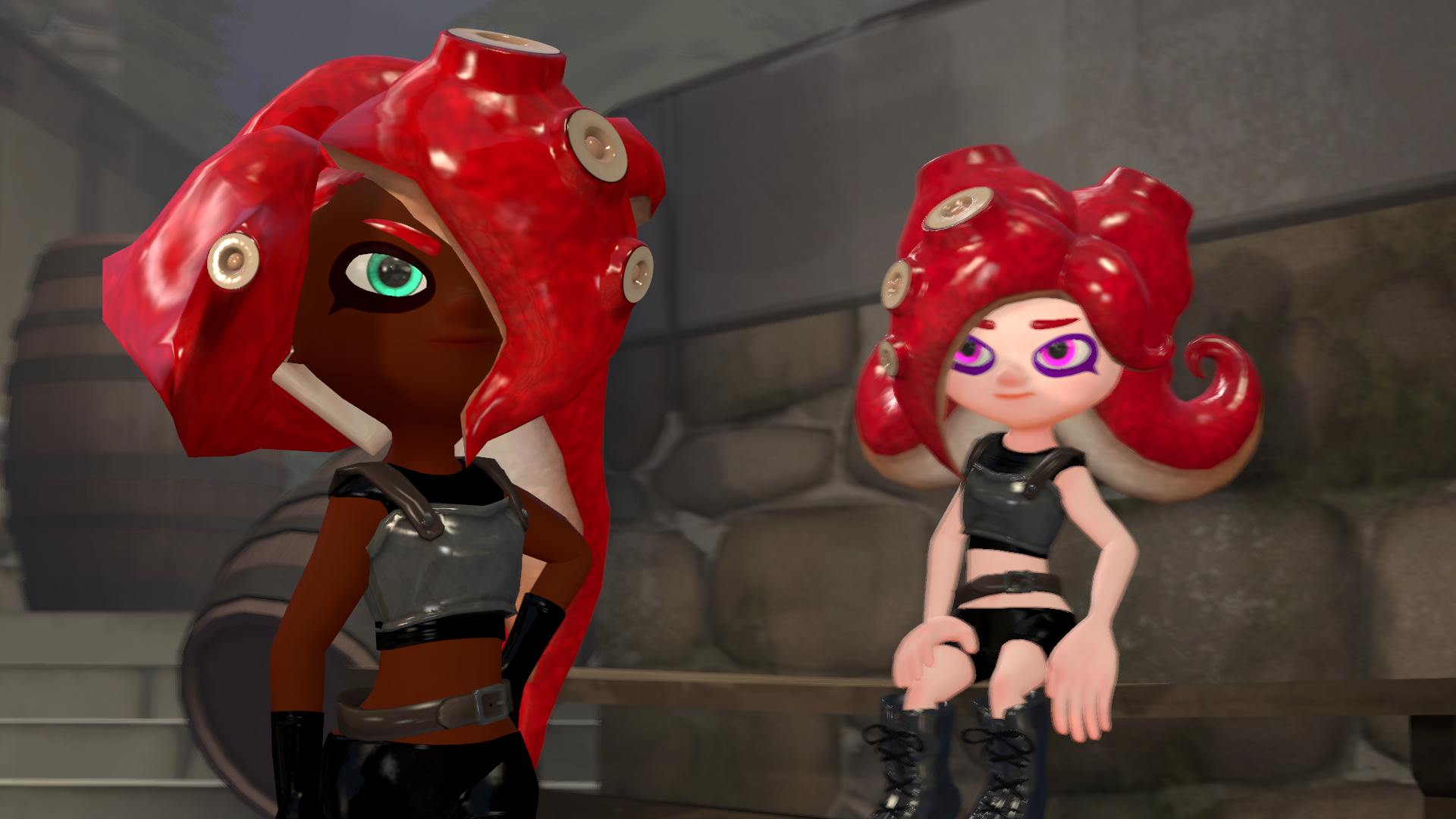
Vision: Another awesome posing with the characters. The problem, what the main Octoling face it, and how she wants to change looks frightening, but in a way optimistic. And in the background, the poor Octoling, how she sees that this is not going well, also gives more fearsome atmosphere to the poster, and the audience can feel, this is something, that not going well now. Of course, there are a few problems with the armours – they look weird on the characters. This is something, that I have to said. However, the fact of the front Octoling tentacle is something, what I must say – it looks overwhelming, and have a touch for everybody, from the army, to the enemy. This is what I can say here.
Originality: Not that much changed from your past posters. It can be a terrible thing, but I don’t know – for your comics, this style looks great to work with it. Since as a page, you don’t have to focus on everything, only the important, or more memorable part. However, in the same time – I think, this can be a vital part of your comic – and judging by this fact, I should say, you should put a bit more effort to this. So, the audience easily remember to this part, and get excited about the future, what will the others going to do.
Technique: Once again, you’re getting better and better with the shadow effects. It looks so natural, yet beautiful. I don’t know, but here, you did an excellent job – I don’t think that you should put that amount of effort here – I would say, that you should work a bit more with the characters, since the effects looks really great at the moment.
Impact: Once again – the characters design is great, but their poses where it can’t be as memorable, as you should want to be. How they look, and their facial expressions are just outstanding, but the lack of attitudes from the characters, what begs me now.
Overall: It can be a harsh review, I should say. But I didn’t like this poster, since in one way, you impressed the audience and me with the world, and the look. However, the lack of interactivity what I have to say as a bad thing. Maybe, you should add some weapons next time, or someone else – since from you, you are really great, when we talk about this kind of interactivity. Even though, I still love this poster in a great way!
Szabolcs